Move beyond random decoration to create a deeply personal home that tells your story—without chaos.
Eclectic interior design is more than just mixing styles; it’s a deliberate art of curation that balances personal expression with intentional harmony. This guide unpacks the philosophy, core principles, and actionable framework to help you create a space that feels uniquely yours—without tipping into visual chaos. Discover how to select meaningful pieces, establish unifying threads, and navigate common challenges with adaptable solutions tailored to your constraints, context, and evolving journey.
Introduction
Walk into a truly exceptional eclectic interior, and you feel an immediate sense of authenticity. This isn’t a showroom replicated from a catalog; it’s a space layered with history, memory, and intention. Each object holds significance—a vintage armchair reupholstered in contemporary fabric, a handwoven textile paired with minimalist lighting, artwork gathered across years of travel. Yet despite stylistic diversity, the room feels calm, cohesive, and deeply inviting. This is the hallmark of successful eclectic design: harmony born not from uniformity, but from thoughtful curation.
The term “eclectic” derives from the Greek eklegein, meaning “to choose” or “to select.” In design, this distinction is essential. Eclecticism is not randomness; it is the conscious selection of elements from varied periods, cultures, and aesthetics to create a unified whole. Tracing its roots from 18th-century Grand Tour collections—where travelers brought artifacts home as narrative anchors—to bohemian salons and contemporary global fusion movements, eclectic design has long celebrated spaces that reflect lived experience. It gently rejects rigid stylistic rulebooks in favor of individuality, memory, and meaning.
However, the path to curated harmony is often misunderstood. Many attempt eclectic design only to encounter spaces that feel cluttered or unintentionally mismatched. The difference between “collected” and “cluttered” lies entirely in foundational principles. This guide bridges that gap. We move beyond superficial tips (“mix patterns!” or “add vintage!”) to explore the underlying philosophy, an actionable framework used by design professionals, and nuanced decisions that transform beloved objects into a soulful, functional environment. Whether starting fresh or refining an existing space, this resource offers adaptable pathways—honoring your budget, timeline, spatial constraints, and personal rhythm. Your home evolves as you do; this practice meets you where you are.
The Curated Harmony Framework: Three Layers to Intentional Eclecticism
At the heart of every resonant eclectic interior lies intentional structure—a quiet architecture beneath visible diversity. We call this the Curated Harmony Framework. It operates across three interconnected layers: Foundation, Expression, and Refinement. Think of it as composing music: the Foundation sets key and rhythm (providing stability), Expression introduces melody and instrumentation (sharing personality), and Refinement balances dynamics and texture (ensuring cohesion). Skipping any layer risks dissonance. Let’s explore each with nuance, adaptability, and care.
Layer 1: The Foundation – Establishing Invisible Structure
Before selecting furniture or art, the Foundation layer creates the quiet scaffolding for cohesion. Largely unseen by visitors, it prevents visual overwhelm through three essential pillars: a unifying color strategy, intentional scale and proportion, and planned negative space. Environmental psychology suggests that spaces with clear visual hierarchy and predictable rhythms can reduce cognitive load and support a sense of calm—making this layer deeply functional, not merely aesthetic.
Why this layer matters: Without consistent underlying choices, diversity becomes noise. The human eye seeks subtle patterns; a shared undertone, balanced scale, or intentional pause gives the mind space to appreciate individual pieces without fatigue. This layer adapts to your context—seasonal light shifts, room function, or spatial constraints—and evolves as your needs change.
How to establish your Foundation:
-
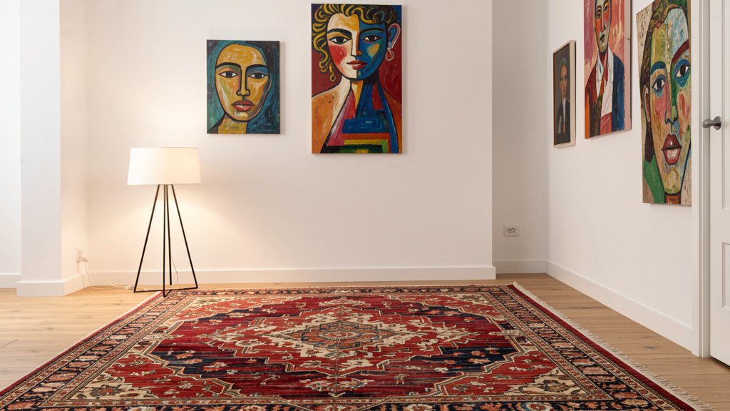
The Unifying Color Strategy: Color acts as the silent conductor. Begin with a neutral base palette (approximately 60% of visible surfaces): walls, large upholstery, flooring. Choose neutrals sharing a consistent undertone—warm (creams, taupes, beiges) or cool (soft grays, icy whites)—to create inherent harmony. Introduce a secondary color (around 30%) through medium elements like rugs, curtains, or secondary furniture. Reserve 10% for accent colors drawn from meaningful objects: the ochre in a handmade pottery vase, the indigo in a textile from travels. Crucially, repeat that accent hue in at least two other subtle places—a book spine, ceramic base, stitched detail—to create visual threads. This repetition builds narrative cohesion without rigidity.
Concrete Example: A living area features warm white walls (base), an oat-colored linen sofa (base), and light oak floors (base). A muted sage kilim rug and linen curtains form the secondary layer. Terracotta—pulled from a hand-thrown vase—reappears in a leather journal’s stitching and a ceramic lamp base. The repetition feels intentional, not accidental. In cooler northern climates with limited winter light, leaning into warm undertones can enhance perceived coziness; in sun-drenched southern homes, cooler neutrals may feel more balanced seasonally.
-
Intentional Scale and Proportion: Eclecticism celebrates stylistic variety, not chaotic scale shifts. Assess your room’s dimensions first. Select major furniture (sofa, bed, table) in a scale appropriate to the space. Then, thoughtfully introduce one contrasting-scale element as a focal point—a slender floor lamp beside a substantial armchair, or a curated cluster of small frames creating collective impact. Measure carefully. Sketch a simple floor plan (graph paper or free digital tools) to visualize flow and breathing room. Remember: negative space is active design—not emptiness. It allows objects to be seen and appreciated.
Counter-Example: A large ornate armoire in a compact bedroom may overwhelm. Solution paths vary by constraint:
– Space-limited: Choose low-profile bedding, wall-mounted sconces instead of nightstands, and position the armoire to preserve clear pathways.
– Budget-limited: Style the armoire minimally—open one door to display neatly folded textiles, use the top for a single sculptural object.
– Temporary space (rental): Use removable hooks to hang a lightweight textile over part of the armoire, softening its visual weight without permanent change.
Scale is relational. What matters is how elements converse within your specific context. -
Planned Negative Space: Before adding objects, identify where the eye can rest. Aim for 25–35% of walls and major surfaces to remain visually quiet: a solid-color wall section, the expanse of a plain sofa cushion, the surface of a simple wooden table. In a room rich with pattern or texture, these calm zones become essential anchors. Conversely, in a minimalist-leaning space, a single textured textile on an otherwise plain wall provides gentle counterpoint.
Real-Life Application: On a bookshelf, group books by color or height for rhythm. Place one meaningful object on a shelf, leaving adjacent shelves partially empty. These intentional gaps create visual breathing room. During busier seasons (holidays, family visits), you might temporarily reduce displayed items to preserve calm; in quieter months, thoughtfully add a seasonal element—a woven basket for blankets in winter, a small vase of dried grasses in autumn. Negative space adapts to life’s rhythms.
Common Foundation Considerations:
* Mixed Undertones: Warm beige walls with cool gray sofa fabric can create subtle dissonance. Adaptive Fix: Hold samples side-by-side in your room’s natural light at different times of day. If tension exists, simplify toward one undertone family. When updating isn’t feasible (e.g., rental), use textiles—rugs, throws, large art—to bridge the gap visually.
* Flow Between Rooms: Disconnected rooms feel jarring. Adaptive Fix: Carry one foundational element through adjacent spaces—a wood tone in flooring or furniture, your accent color in small doses (a vase here, a pillow there). In open-plan homes, area rugs can define zones while maintaining visual continuity.
* Overfilled Surfaces: Clutter triggers visual fatigue. Adaptive Fix: Apply the “step-back test.” After styling a surface, step away. Where does your eye rest? Remove one item. Often, simplicity strengthens impact. For households with children or frequent guests, designate “calm zones” (e.g., one clear console table) amid necessary activity areas.
The Guiding Insight: Cohesion in eclecticism emerges not from matching items, but from repeating intentional choices. A shared undertone, a rhythmic scale relationship, or a planned moment of calm—these subtle threads transform individual objects into a unified, breathing space.
Layer 2: The Expression – Curating with Intention and Narrative
With Foundation in place, Expression breathes soul into your space. This layer celebrates your journey, interests, and values through carefully chosen objects. Crucially, “deliberate” is the anchor. Expression isn’t about acquiring everything you love; it’s about curating pieces that resonate deeply and arranging them to tell a coherent, evolving story. This layer honors sustainability—choosing vintage, secondhand, or ethically made items reduces environmental impact while adding unique character.
Why this layer matters: A perfectly structured room without personal resonance feels sterile. Expression answers, “Who lives here?” Yet without Foundation constraints, it risks chaos. The Framework ensures self-expression serves harmony. It also adapts beautifully to constraints: tight budgets, rental limitations, or evolving family needs.
How to cultivate meaningful Expression:
-
The Art of the Edit: Quality Over Quantity: Begin with objects holding genuine meaning—travel mementos with stories, inherited textiles, art by loved ones, well-loved books. Apply gentle discernment:
- Does this spark authentic connection or memory?
- Does it contribute to the room’s evolving narrative?
- Does it offer visual interest (form, texture, color) or deep sentimental value?
Release items kept from obligation, guilt, or past trends. A single framed map from a pivotal trip holds more power than a crowded gallery of generic prints. This mindful curation aligns with sustainable practices—honoring resources by surrounding yourself only with what matters.
Budget-Conscious Path (Method B): Focus investment on one “hero” piece per room—a thrifted armchair reupholstered in meaningful fabric, a handwoven textile from a local maker. Style it prominently against your neutral Foundation. Support it with simpler, affordable elements (solid pillows, a basic tray) that elevate, not compete. This builds authenticity incrementally.
Immediate Calm Path (Method C): Overwhelmed? Reset one high-visibility surface (entry console, coffee table). Clear completely. Return only three items: one functional (a tray for keys), one textural (a smooth stone, wooden bowl), one meaningful (a small framed photo). This tiny act creates instant intentionality. In rentals, use removable adhesive hooks for art—no damage, full expression.
-
Creating Dialogue Between Eras and Styles: The magic lives in thoughtful juxtaposition. Place a sleek credenza beneath an ornate vintage mirror. Pair a rustic farmhouse table with transparent acrylic chairs. To feel intentional, seek a “bridge” element: shared wood tone, repeated shape (curved legs echoing a rounded mirror frame), or a color pulled from both pieces. Grouping objects by color across styles also creates unity—a shelf holding a ceramic vase, brass candlestick, and glass paperweight in varying amber shades feels curated, not chaotic.
Analogy: Your room is a thoughtful gathering. You invite diverse voices (styles) who share a common value (your bridge element: material, hue, form) enabling genuine connection. The Baroque mirror and mid-century credenza aren’t clashing; they’re conversing about craftsmanship across time, united by walnut accents.
-
Layering Textures and Patterns with Purpose: Texture invites touch and emotional warmth. Pattern adds rhythm. Start within your Foundation palette. When mixing patterns, vary scale dramatically (large floral + tiny geometric) and ensure they share at least one color from your base or secondary palette. For textures, balance smooth and rough, matte and luster: a nubby wool throw on smooth leather, a rough-hewn bowl on polished stone. Avoid overloading one small area—limit to 2–3 distinct textures per vignette. In humid climates, prioritize mold-resistant natural fibers (jute, seagrass) over delicate wools; in dry winters, layer in soft knits for comfort and moisture retention.
Nuance: Texture carries visual weight. A heavily bouclé sofa demands smoother companions (sleek side table, flat-weave rug). A room of smooth surfaces (glass, metal) feels cooler; introduce one deeply textured element (chunky knit, woven wall hanging) for warmth. Seasonally, swap lighter linens for heavier wools as temperatures shift—expression adapts to lived experience.
Expression Considerations:
* Thematic Traps: “Everything Moroccan” feels like a set, not a home. Adaptive Fix: Use inspiration loosely. One Moroccan pouf adds global flair amid Scandinavian and industrial pieces. Let your story guide selections, not rigid themes.
* Trend Temptation: Prioritize enduring connection over fleeting trends. Adaptive Fix: If drawn to a trend (cane detailing, specific color), incorporate it through replaceable items—a pillow, small chair—not permanent investments. Anchor rooms with timeless, meaningful pieces.
* Function Forgotten: Beauty without usability creates friction. Adaptive Fix: Ensure objects earn their place through utility or profound meaning. Reupholster that stunning but uncomfortable vintage chair. Place delicate items in low-traffic zones. In family homes, choose durable, washable textiles for high-use areas; reserve delicate pieces for quieter spaces.
Layer 3: The Refinement – The Final Polish of Intentionality
Refinement transforms “decorated” into “composed.” It’s the meticulous attention to detail that signals care: lighting layers, hardware harmony, sightline awareness, and the final edit. These subtle cues eliminate subconscious friction, allowing the space to feel effortlessly intentional. Refinement respects your time—it offers scalable steps, from five-minute tweaks to weekend projects.
Why this layer matters: The eye perceives nuance. Inconsistent details (mismatched metals, harsh lighting) create quiet dissonance. Refinement resolves this, elevating the entire composition. It’s deeply adaptable—renters, homeowners, and those with limited mobility can all apply meaningful refinements.
How to execute Refinement:
-
Layered Lighting for Atmosphere and Function: Avoid single overhead sources. Create three layers:
- Ambient: General illumination (recessed lights, central fixture on dimmer).
- Task: Focused light (adjustable lamp for reading, under-cabinet kitchen lights).
- Accent: Highlighting features (picture light on art, discreet spotlight on sculpture).
Fixtures can express style—a vintage pendant, modern sconces—yet share a unifying thread: consistent finish (all matte black, all unlacquered brass), repeated shape (circular elements), or material (wood, glass). Warm-white bulbs (2700K–3000K) throughout enhance cohesion and comfort. Dimmers are invaluable for adapting mood to time of day or occasion. In rentals, plug-in wall sconces or floor lamps replace hardwired fixtures; store originals for move-out.
Practical Implementation: A living room uses dimmable recessed lights (ambient), an arc floor lamp by the chair (task), and a small picture light on cherished art (accent). Though styles vary (mid-century lamp, industrial sconce), all feature matte black metal—a subtle thread. During winter evenings, warmer dimmed light supports circadian rhythms; in summer mornings, slightly brighter ambient light complements natural sun.
-
Hardware and Finish Harmony: While furniture styles may diverge, visible finishes benefit from cohesion. Limit dominant metal finishes to two (e.g., primary: brushed brass on lights and hardware; secondary: black iron on furniture legs). Avoid chrome, nickel, gold, and bronze competing in one sightline. Updating cabinet pulls or knobs is a high-impact, low-cost refinement. For wood tones, balance is key: one light, one medium, one dark piece can feel intentional; five similar-but-not-identical mid-tones may feel haphazard. Grouping tones by zone (dining area in walnut, living shelves in oak) creates calm pockets.
Constraint-Aware Solution: Love a vintage dresser with brass pulls but your scheme uses matte black? Options:
– DIY: Refinish pulls with metal-safe matte black spray paint (rental-friendly if reversible).
– Bridge: Introduce small brass accents elsewhere (frame, tray) to make the contrast feel deliberate.
– Accept: If the piece holds deep meaning, let it stand as a cherished exception—context transforms “mismatch” into “story.” -
The Final Edit: Fresh Eyes and Human Experience: After arranging, step away for 24 hours. Return with a critical yet kind perspective. Take a photo and view it in grayscale on your phone—this reveals imbalances in light/dark, scale, or composition invisible in color. Ask gently:
- Is there a clear focal point?
- Does visual weight feel balanced?
- Are there 2–3 places where the eye can rest comfortably?
- Does every item feel necessary or loved?
Remove the weakest link. Often, subtraction strengthens the whole. Then, sit in primary seating positions. Observe sightlines from doorways. Adjust so key vignettes are visible and balanced. Refinement is experienced through living—not just viewing.
Pro Tip: In multi-generational homes, involve others in the edit. A child might identify a “cluttered” shelf; a partner might notice an awkward sightline. Collaborative refinement builds shared ownership and deeper connection to the space.
Refinement Considerations:
* Overlooked Sightlines: A room perfect from one angle may feel chaotic from the hallway. Adaptive Fix: Sit in key spots (favorite chair, bed). Adjust arrangements so focal points and balanced compositions are visible from these lived-in perspectives. Check entryway views—what greets you upon entering?
* The Fifth Wall and Floor: Ceilings and floors complete the experience. In rentals, removable wallpaper inside a bookshelf adds pattern without commitment. Ensure rugs are appropriately sized (front furniture legs on rug in living areas) and harmonize with your Foundation palette. A well-chosen rug defines space, absorbs sound, and adds warmth underfoot—critical in hard-surface apartments.
* Rushing the Process: Authentic eclecticism evolves. Adaptive Fix: Embrace “good enough for now.” Live with the space. Notice what works after a week. Add or adjust gradually. The most resonant interiors grow alongside their inhabitants—each piece chosen with care over time.
Beyond the Living Room: Applying the Framework Across Spaces
The Curated Harmony Framework adapts fluidly to any room, honoring function, constraints, and personal rhythm. Below are nuanced applications addressing specific intents, seasonal shifts, and practical limitations.
The Eclectic Kitchen: Function, Character, and Flow
Kitchens demand calm amid activity. Foundation is paramount: durable, neutral cabinetry (white, warm wood, soft gray) creates a serene backdrop. Expression shines through curated, functional objects: open shelving displaying cherished dishware (blue-and-white transferware, hand-thrown mugs), a vibrant runner rug in easy-clean flatweave, or a vintage-style range as a focal point. Refinement appears in hardware consistency (all pulls in one finish), warm lighting under cabinets, and intentional countertop editing—only daily-use items remain visible.
Budget-Conscious Adaptation: Can’t replace cabinetry? Transform with new hardware (<$100). Add open shelving by removing upper cabinet doors. Display curated dishware—group by color for instant cohesion. A bold backsplash tile (in your accent color) creates focal energy without structural change.
Seasonal & Constraint Awareness:
– Small Space: Use vertical storage. Mount rails for utensils. Choose bar stools that tuck fully under counters.
– Seasonal Rotation: Display citrus bowls in summer; swap to ceramic canisters with wooden spoons in autumn.
– Rental-Friendly: Use removable peel-and-stick backsplash tiles. Add a large, patterned rug to define the space and protect floors. Store generic appliances; display only beautiful, functional tools.
Friction Solution: “Open shelves look messy.” Apply the “Rule of Three”: group items in odd numbers. Use uniform containers for dry goods (glass jars). Rotate displays seasonally—fresh herbs in spring, woven baskets in winter—to maintain intentionality.
The Eclectic Bedroom: Sanctuary Through Calm Curation
Prioritize tranquility. Foundation leans into soothing, monochromatic neutrals for walls and large furniture. A consistent wood tone for bed frame and nightstands (even with slight style variations) fosters calm. Expression is intimate: personally significant art above the bed, layered bedding textures (crisp cotton sheets, chunky knit throw), but limit patterns to two complementary prints to support rest. Refinement focuses on warm, adjustable lighting (2700K bulbs), wall sconces freeing bedside space, and minimal surfaces—only a favorite book, small object, or simple lamp on nightstands.
Nuance for Constraints:
– Small Bedroom: Choose a low-profile bed. Use mirrors to reflect light. Select one meaningful art piece above the bed instead of a gallery. Under-bed storage with uniform bins preserves visual calm.
– Shared Space (Partners): Each selects one non-negotiable item. Find bridges: his industrial lamp and her ceramic vase share a black base. Create small personal zones within the shared room—a reading nook with her textiles, his desk area with meaningful objects.
– Seasonal Shifts: Swap lightweight linen throws for heavier wool blankets in colder months. In humid climates, choose breathable, moisture-wicking bedding materials year-round.
Friction Solution: “Too many sentimental items.” Designate one small shelf or box for rotating displays. Photograph items not currently displayed. Honor memory without visual overload.
The Eclectic Home Office: Focus, Inspiration, and Flow
Balance creativity and concentration. Foundation establishes a clear work zone: paint the desk wall a subtle, deeper shade of your room’s neutral to create a “focus anchor.” Expression supports productivity: within direct sightline, place only what inspires—a small plant (biophilia), one meaningful art piece, a cherished object. Store supplies in closed cabinets to minimize distraction. Refinement is critical: ergonomic seating (a vintage chair reupholstered for support), layered lighting (adjustable task lamp + ambient floor lamp), and meticulous cable management (clips, sleeves) maintain calm.
Constraint-Aware Solutions:
– Tiny Nook: Use a wall-mounted desk. Add a slim shelf above for essential supplies. A large mirror opposite the desk creates perceived space.
– Shared Family Space: Use a room divider (a tall plant, open shelving unit) to define the zone. Choose a desk color that bridges the room’s palette.
– Budget Path: Thrift a solid wood desk; sand and oil for warmth. Use Command™ strips for art. A single high-quality task lamp transforms functionality.
Friction Solution: “I need storage but hate cluttered shelves.” Combine closed storage (vintage cabinet for files) with curated open shelving. Display only inspiring items: beautifully bound books (spines aligned by color), one sculptural object. Group similar items. Closed storage contains chaos; open shelves tell your story.
The Eclectic Bathroom: Personality in Compact Spaces
Even small bathrooms embrace eclecticism. Foundation = simplicity: large-format neutral tiles, clean-lined vanity. Expression emerges through curated details: a vintage mirror with character, unique sconces, apothecary jars for cotton balls. Textiles offer changeable flair—a Turkish peshtemal towel, embroidered bath mat. Refinement ensures cohesion: match faucet, shower hardware, and sconce finishes. A small stool displays a plant, candle, soap dispenser. Every item must earn its place—prioritize function and meaning.
Budget & Rental Adaptations:
– Swap generic shower curtain for a vintage textile (hemmed simply) or bold graphic print.
– Replace basic hardware with vintage brass finds from salvage yards (seal properly for moisture).
– Add one framed botanical print in a thrifted frame.
– Use removable wallpaper inside a medicine cabinet for a hidden pop of joy.
Seasonal Touch: Display eucalyptus in the shower during humid months for aroma and moisture absorption; swap to dried lavender bundles in drier seasons.
Friction Solution: “Countertops get cluttered.” Use drawer organizers. Store daily items in matching containers. Keep only one beautiful soap dispenser and toothbrush holder visible. In shared bathrooms, assign small trays per person for personal items—order within flexibility.
Navigating Common Frictions: Practical Pathways Forward
Challenges are natural. Below are adaptable solutions grounded in principle, not perfection. Each offers multiple pathways—choose what fits your constraints, energy, and context today.
Friction 1: “My Room Feels Cluttered, Not Curated.”
Clutter stems from visual competition, not object count. It’s the absence of breathing room and hierarchy.
- Gentle Diagnosis: Take a grayscale photo. Is there a focal point? Balanced visual weight? Areas where the eye can rest? Clutter often appears as too many items demanding attention simultaneously.
- Adaptable Solutions:
- The 3-Question Edit (5 minutes): On one surface (coffee table, console), ask:
- Does this serve a necessary function right now?
- Does this bring genuine joy or hold irreplaceable meaning?
- Does this contribute to this room’s story?
Remove items answering “no” to two or more. Start small—success builds momentum. - Surface Reset (15 minutes): Clear one high-visibility surface completely. Return only three items: functional, textural, meaningful. Notice the calm.
- Zone Approach (Ongoing): Tackle one zone weekly (bookshelf Monday, entry console Wednesday). Prevents overwhelm.
- Household Collaboration: In shared homes, involve others. “Let’s clear the kitchen island together—what three things stay?” Shared ownership reduces friction.
- Real Example: Maria felt her living room was chaotic. She applied the 3-Question Edit to her bookshelf. Removed unread books, consolidated small items into one woven basket, left intentional gaps. Added a single piece of driftwood on top. The space felt instantly calmer. The items remaining now had room to be seen and appreciated. She repeated the process weekly in new zones.
Friction 2: “The Pieces I Love Don’t Seem to Go Together.”
This often arises from focusing on style labels (“mid-century,” “traditional”) rather than underlying elements.
- Gentle Diagnosis: Place the two conflicting items side-by-side. What specifically feels dissonant? Color clash? Scale mismatch? Texture tension? Often, conflict exists only in direct proximity.
- Adaptable Solutions:
- Find the Bridge: Search for a shared element—wood tone, shape (curved lines), minor color. Amplify it. If two chairs share leg shape, paint legs the same color. If a rug and painting share a green hue, add a green pillow nearby.
- Spatial Buffer: Place conflicting items in different room zones. Position a neutral element (solid-color chair, simple side table) between them as a visual pause.
- Unifying Textile: Introduce a solid-color rug or neutral curtains to calm the background, allowing contrasting pieces to dialogue more harmoniously.
- Context Shift: Photograph the arrangement. Sometimes, seeing it objectively reveals the bridge you missed.
- Illustrative Path: David loved his grandmother’s dark wood secretary but felt it clashed with his white modern sofa. He noticed both featured strong vertical lines. He placed a slender black floor lamp (echoing verticality) between them. Added a black-framed abstract print above the sofa. The secretary was no longer isolated—it joined a visual conversation about line and form. The room felt intentionally composed.
Friction 3: “I’m Afraid of Making a Mistake / It Feels Too Personal.”
Vulnerability is inherent in creating a space that reflects you. This fear is common and valid.
- Reframing Pathway: Shift from “mistake” to “experiment.” Your home is a living document of your journey—not a permanent verdict.
- Start Micro: Choose one low-stakes area—a bookshelf corner, a single wall behind the sofa. Use removable elements: lean art instead of hanging immediately; test pillow combinations before committing.
- Document Progress: Take “before” and “after” photos. Reviewing your successful vignettes builds confidence.
- Honor Your “Why”: When sharing your space, briefly share the story behind a piece (“This textile was woven by an artisan I met in Oaxaca”). Context transforms perceived “clash” into appreciated character.
- Permission to Evolve: Paint can be repainted. Art can be rehung. Your taste will grow; your space can grow with it.
- Encouraging Perspective: The most memorable homes aren’t flawless magazine spreads. They’re spaces layered with authentic stories—slightly worn chairs with history, art that sparks conversation, objects that hold memory. Your unique perspective is your greatest design asset. Trust the process, not perfection.
Friction 4: “How Do I Blend My Partner’s/Family’s Tastes With Mine?”
Eclecticism thrives on fusion—it’s in the name. This friction is an opportunity for deeper connection.
- Collaborative Pathway:
- Shared Curation Session: Each person selects three non-negotiable meaningful items for the shared space. No judgment—just sharing “why” each matters.
- Find Bridges Together: Using the Framework, identify connections. Her love of bohemian textiles and his industrial metal pieces might unite through a shared indigo hue or repeated geometric shape.
- Designated Zones: Create small personal areas within the shared room—”your” reading nook with preferred lamp and chair, “their” desk reflecting their aesthetic. The unifying Foundation (shared wall color, flooring) ties zones together.
- New Shared Symbol: Collaborate on one new element representing your union—a custom map marking significant places, a piece made together.
- Real Integration: Lena (bohemian textiles) and Sam (industrial metal) established warm white walls and light oak floors as their Foundation. Lena’s vintage kilim rug became the heart. Sam’s metal coffee table sat atop it. The bridge? The rug’s deep indigo echoed in Lena’s armchair cushions and the binding of books on Sam’s metal shelf. They added a shared world map with brass pins marking travels together. The room felt uniquely theirs—a true fusion of stories.
Your Questions, Answered
Q: Is eclectic design the same as bohemian or maximalist design?
A: While related, they differ in philosophy. Bohemian (boho) is a subset of eclectic style with specific free-spirited, globally inspired aesthetics (macramé, rattan, layered textiles). Maximalism refers to density of decoration (“more is more”), which can exist within eclectic design but isn’t required. Eclecticism is broader: it’s the intentional curation of elements from diverse sources to create harmony. A room can be eclectic and minimalist (a Shaker chair beside a modern desk) or eclectic and abundant. Bohemian is a flavor; maximalism is a volume level; eclecticism is the guiding principle of thoughtful selection.
Q: How do I start if my current home is very neutral or matchy-matchy?
A: Begin gently with Layer 2 (Expression). Introduce one “hero” piece you genuinely love—a vintage rug from a flea market, an unusual lamp, meaningful art. Let it guide your accent color. Gradually edit out items that no longer serve the evolving story. Swap generic pillows for textured ones echoing your hero piece. Add one chair in a contrasting style but complementary color. Progress incrementally. Start with the room you use most; let its transformation inspire confidence. There’s no need to overhaul everything at once—each intentional addition builds momentum.
Q: Can I use IKEA or big-box store furniture in an eclectic home?
A: Absolutely—and strategically. Mass-produced furniture excels as a neutral Foundation canvas. A simple IKEA sofa in a solid neutral provides calm backdrop for expressive vintage chairs, unique art, and layered textiles. Customize thoughtfully: swap generic hardware for distinctive pulls, add a custom slipcover in meaningful fabric, style shelves with curated collections. Many design professionals use affordable basics intentionally, reserving budget for distinctive accent pieces. This approach is practical, accessible, and aligns with mindful consumption—using what works while adding soulful touches.
Q: How do I mix wood tones without it looking messy?
A: Move beyond the outdated “all must match” rule. Try these adaptable guidelines:
1. Anchor: Let one wood tone dominate (e.g., light oak floors).
2. Introduce Contrast: Add one or two distinctly lighter or darker tones (dark walnut coffee table, medium cherry chair). Avoid multiple similar-but-not-identical mid-tones—they compete.
3. Create Bridges: Use rugs, textiles, or art containing hues from all wood tones to visually link them. A rug with warm browns bridges light floors and a dark bookshelf.
4. Zone Grouping: In open plans, keep wood tones consistent within functional zones (dining area in walnut, living area in oak).
When uncertain, introduce a large area rug that harmonizes the tones present. Trust your eye—if it feels calm to you, it is working.
Q: What’s the difference between an accent wall and using color in eclectic design?
A: A single bold-painted wall unrelated to the room’s palette can feel isolated. Eclectic color integration is more nuanced: use the adapted 60-30-10 approach (60% base neutral, 30% secondary color, 10% accent). Pull your accent color from a meaningful piece (art, textile) and repeat it in at least two other subtle places. If desiring pattern, choose wallpaper incorporating your entire palette (base, secondary, accent colors). Color should feel like a natural thread in the room’s story, not a disconnected statement. In rentals, removable wallpaper on one wall or inside a bookshelf offers commitment-free color exploration.
Q: How do I incorporate family heirlooms or pieces I feel obligated to keep?
A: First, gently distinguish obligation from genuine connection. If kept from guilt (not love), consider photographing it and passing it to someone who cherishes it. If it holds true meaning:
– Refresh Context: Reupholster a dated chair in contemporary fabric fitting your palette. Refinish dark wood in a lighter stain. Repaint an ornate frame matte black to bridge traditional and modern.
– Intentional Placement: Position it as a focal point—refinished heirloom dresser in a bedroom paired with modern bedside tables. The contrast highlights its beauty and history.
– Honor the Story: Share its history when guests notice it. Context transforms obligation into celebration. Your space should hold what you choose to keep, not what you feel forced to display.
Q: Is there a limit to how many styles I can mix in one room?
A: There’s no fixed number, but clarity of narrative matters most. A room blending 5+ distinct styles (Art Deco, Industrial, Scandinavian, etc.) can succeed with a very strong Foundation (unified color, scale) and intentional curation. For most, starting with 2–3 core styles yields a clearer story. Ask: “What feeling should this room evoke?” (e.g., “calm” might blend Scandinavian + Japanese; “energetic” might blend Moroccan + Mexican Modernism). Additional styles should appear as subtle accents (a single Art Deco mirror), not competing focal points. Connection quality outweighs style quantity.
Q: How do I know if my eclectic space is ‘too much’?
A: Trust two gentle tests:
1. Visual Rest Test: Stand in the doorway. Can your eye find 2–3 places to rest comfortably (solid wall section, smooth table surface, negative space)? If your gaze darts frantically with no pause, edit.
2. Squint Test: Photograph the room and squint. Does a clear focal point emerge, or is it a blurry mass of competing elements? If blurry, remove items until composition clarifies.
Remember: the goal is harmony through diversity, not sensory overload. When uncertain, subtract. A calm, inviting space always resonates more deeply than an overwhelming one—no matter how interesting individual pieces may be.
Q: Can eclectic design work in a rental with restrictions (no painting, etc.)?
A: Rentals are ideal for practicing portable eclecticism. Focus energy on Layers 2 and 3 with non-permanent solutions:
– Use removable peel-and-stick wallpaper on one wall or inside bookshelves.
– Layer rugs over existing flooring to define zones and add color/texture.
– Update lighting with plug-in wall sconces or statement floor lamps (store originals).
– Style with furniture and textiles: a vintage kilim rug, mix of thrifted chairs, curated art leaned on shelves or hung with damage-free hooks rated for item weight.
– Use removable window film for privacy or pattern.
Limitations often sharpen creativity. Your eclectic signature becomes movable—a curated collection that travels with you, telling your story wherever you land.
Q: How does lighting temperature (Kelvin) affect an eclectic space?
A: Lighting temperature is a quiet but powerful part of your Foundation. Inconsistent bulbs (cool white in kitchen, warm white in living room) create visual discord and distort colors. For cohesive warmth throughout living spaces, standardize on warm-white bulbs (2700K–3000K). This range complements wood tones, skin tones, and most palettes, enhancing comfort. Avoid daylight bulbs (5000K+) in living areas—they feel clinical and undermine eclectic warmth. In rentals, replace bulbs immediately upon moving in. For fixtures with non-replaceable LEDs of incorrect temperature, supplement with plug-in lamps using your preferred bulbs. Consistent, warm lighting is one of the most impactful yet affordable refinements—making every element feel harmonious and welcoming.
Q: What if I inherit a space with bold existing elements (dark wood paneling, colorful tile)?
A: Work with the element; don’t fight it. Honor it as part of your space’s story.
– Dark Paneling: Embrace as your dominant wood tone and base neutral. Choose furniture/textiles with warm undertones. Use paneling as a dramatic backdrop for lighter furniture (white sofa) and curated art. Add warm lighting to soften shadows.
– Colorful Tile: Pull one subtle hue from the pattern to use as your accent color elsewhere (a pillow, small vase). Let the tile be the room’s anchor.
Fighting existing architecture creates tension; integrating it builds character. Many celebrated eclectic interiors transform challenging features into beloved assets through thoughtful curation. Your space’s history is part of its narrative—invite it in.
Q: How can I make my eclectic design more sustainable?
A: Eclecticism naturally aligns with mindful consumption. Prioritize:
– Secondhand First: Thrift stores, antique markets, estate sales, and online resale platforms (Facebook Marketplace, eBay) offer unique pieces with history and lower environmental impact.
– Repair and Refresh: Reupholster worn chairs, refinish scratched wood, mend textiles. These acts honor craftsmanship and extend life.
– Ethical New Purchases: When buying new, research brands with transparent supply chains, fair labor practices, and sustainable materials (FSC-certified wood, organic cotton, recycled metals).
– Mindful Editing: The “art of the edit” reduces waste. Cherish fewer, meaningful items. Donate or gift items no longer serving you.
Sustainable eclecticism isn’t about perfection—it’s about intention. Each conscious choice supports a healthier home and planet.
Conclusion and Your Next Step
Eclectic interior design is not a style to replicate—it is a practice of mindful curation. It invites you to slow down, honor the stories within your objects, and compose a space that reflects your authentic journey. By anchoring choices in the Curated Harmony Framework—building a supportive Foundation, expressing your narrative with intention, and refining with care—you move beyond anxiety about “getting it right” toward confidence in creating a home that is uniquely, beautifully yours. The most resonant eclectic interiors are not static; they evolve with you, accumulating meaning and depth over time. They welcome conversation, spark memory, and offer comfort because they are undeniably real. They celebrate the beauty of the imperfect, the storied, and the intentionally chosen.
Recap: The Three Pillars of Intentional Eclecticism
- Foundation is Invisible Structure: Cohesion emerges from a unified color strategy (shared undertones), intentional scale relationships, and planned negative space—not matching furniture. This layer is your quiet anchor, adaptable to seasons, constraints, and changing needs.
- Expression is Curated Narrative: Select objects with genuine meaning and visual resonance. Create dialogue between pieces through bridge elements (color, shape, material). Edit with kindness; quality and intention matter more than quantity. This layer is your evolving voice.
- Refinement is Intentional Detail: Unify through layered lighting, harmonious finishes, and attention to human experience (sightlines, comfort). The final edit—removing the weakest link—is what elevates the space from assembled to composed. This layer is your signature of care.
The 24-Hour Invitation: One Gentle Action
Transformation begins with a single step. Within the next day, choose one small, manageable action aligned with your current capacity:
* Feeling Overwhelmed? Take a grayscale photo of your most challenging room. Clear one surface (coffee table, entry console). Place back only three items: one functional, one textural, one meaningful. Notice the immediate shift toward calm.
* Starting Fresh? Select one cherished object you already own (a textile, souvenir, book). Identify one color within it. Find one other small item in your home sharing that hue. Place them near each other. You’ve created your first intentional thread.
* Refining Existing Space? Check light bulbs in your main living area. Replace any cool-white bulbs (above 3500K) with warm-white (2700K–3000K). This subtle shift instantly enhances cohesion and warmth.
* Short on Time/Energy? Sit in your favorite chair for two minutes. Notice one thing you appreciate about the space. Acknowledge it. Gratitude is a powerful foundation for change.
This action isn’t about perfection—it’s about presence. It’s a quiet declaration that you are the thoughtful curator of your environment. Celebrate this step. It is the first note in your evolving symphony of space.
The Bigger Perspective
Your home is the backdrop to your life. In a world of mass production and fleeting trends, an eclectic home stands as a gentle testament to what endures: meaning, memory, connection. It honors the past while embracing the present. It finds beauty in contrast and wisdom in curation. This practice extends beyond aesthetics—it cultivates mindfulness, intentionality, and self-awareness. As you learn to curate your space with care, you may find yourself curating other aspects of life with similar grace: relationships, time, energy. Embrace the journey. Celebrate the finds. Learn from the adjustments. In creating a home that is authentically yours, you deepen your connection to the life you live within its walls. Your home is not just where you reside; it is a reflection of your evolving story. Make it true, make it kind, make it yours.
Explore Our Complete System:
The Art of the Curated Shelf: Beyond Decoration | Color Theory for Real Homes: Finding Your Authentic Palette | Sustainable Sourcing Guide: Thrifting, Antique Hunting, and Ethical New Finds | The Psychology of Space: How Room Layouts Influence Mood and Connection | Furniture Flipping 101: Breathe New Life into Vintage Pieces | Textiles as Texture: Weaving Comfort and Story into Every Room | Lighting Layers Decoded: From Ambient Glow to Focused Task Light | The 30-Day Declutter Challenge: Creating Space for What Matters | Seasonal Home Transitions: Adapting Your Space Through the Year